Work
Town of Riedisheim
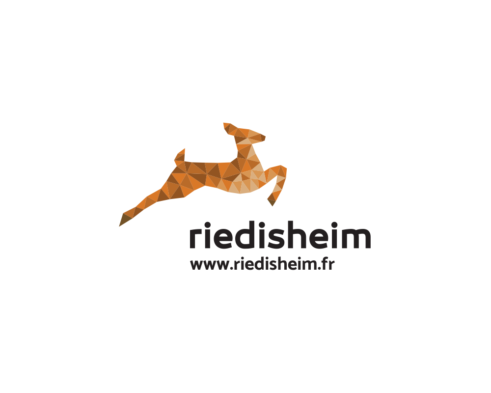
After several years of good and loyal service, the town of Riedisheim put out the creation of its new logo to tender. The doe, the town’s emblem, had to be kept. We simplified it and made it more dynamic, implying that ideas can come to life.

Redesign of the logo
It was necessary to make a clear break with the past in order to respond to the present and stand out from what is often seen in the public domain. The aim, therefore, was to give Riedisheim a clear and original visual identity to make it stand out from other municipalities. The name in lower case letters improves legibility and encourages a feeling of closeness, a little like using a familiar form of address in the scriptures.


